
Is Coca-Cola’s Visual Refresh Driving Brand Confusion? Pollfish Data Shows 35% of Consumers Associate New Font with Marlboro
 While 74% of consumers find Coke’s subtle brand update visually appealing, original research reveals a stark gap between aesthetic approval and brand attribution.
When Coca-Cola unveiled its recent global visual identity refresh on July 20th, 2026, the beverage giant aimed to create a clean, uniform, and archival aesthetic. The brand introduced a secondary serif typeface called “Better With”—featuring words like “authentic” on secondary packaging and marketing collateral—to evoke heritage and craftsmanship. The font was originally created by Brody Associates for Coca-Cola’s holiday campaign a few years prior.
However, the internet quickly repositioned the narrative. Within days of the rollout, viral posts across TikTok, X, and LinkedIn began pointing out a striking visual similarity: Coke’s vintage-inspired serif typography looked suspiciously like the iconic typeface used by Marlboro cigarettes. The comparison gained further momentum due to an existing internet meme that jokingly refers to a cold Diet Coke break as a “fridge cigarette.”
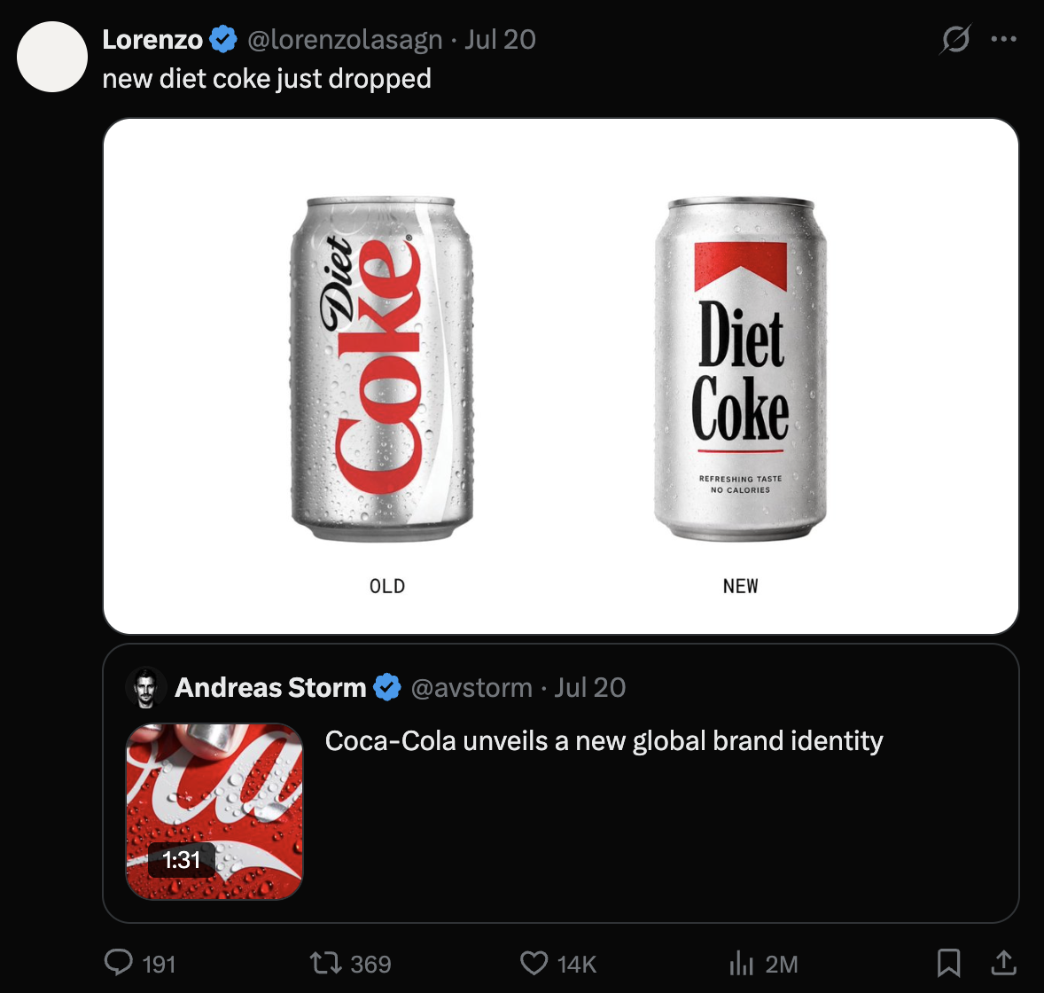
Source: @lorenzolasagn on X (formerly twitter)
To determine whether this viral comparison was merely a noisy social media echo chamber or a genuine brand perception challenge, Pollfish surveyed 400 US consumers to evaluate awareness, visual attribution, and design sentiment.
The findings reveal a classic modern branding dilemma: Consumers love the design, but they don’t associate it with Coca-Cola.
📊 Key Survey Findings at a Glance
- Misattribution: When shown the new secondary serif font in isolation, 35% of consumers associated it with Marlboro. Only 11% correctly identified it as Coca-Cola.
- Aesthetic Approval: The redesign is undeniably attractive—74% of respondents rated the refreshed visual identity as appealing (43% “very appealing,” 31% “somewhat appealing”).
- Low Baseline Awareness: Prior to the survey, 87% of consumers were completely unaware that Coca-Cola had updated its branding.
- Memes Drive Discovery: Of the 14% who were aware of the refresh, 60% reported that social media memes highlighting the Marlboro comparison were the primary reason the update came to their attention.
- Broad Resemblance Recognition: Once prompted with the comparison, 76% of respondents agreed they could see the similarity to Marlboro (36% “strongly,” 40% “somewhat”).
- The “Fridge Cigarette” Effect: Familiarity with the viral “fridge cigarette” slang is sharply age-skewed, reaching 56% awareness among Gen Z (ages 18–24), creating primed cultural conditions for cigarette-adjacent humor.
Prefer to Watch? Watch a 60-Second Video Breakdown
The Unprompted Font Test: High Approval, Borrowed Meaning
To prevent anchoring bias, the Pollfish survey opened with a blind unprompted question: respondents were shown the word “Authentic.” rendered in Coca-Cola’s new secondary serif typeface, with all red packaging, logos, and product cues removed.
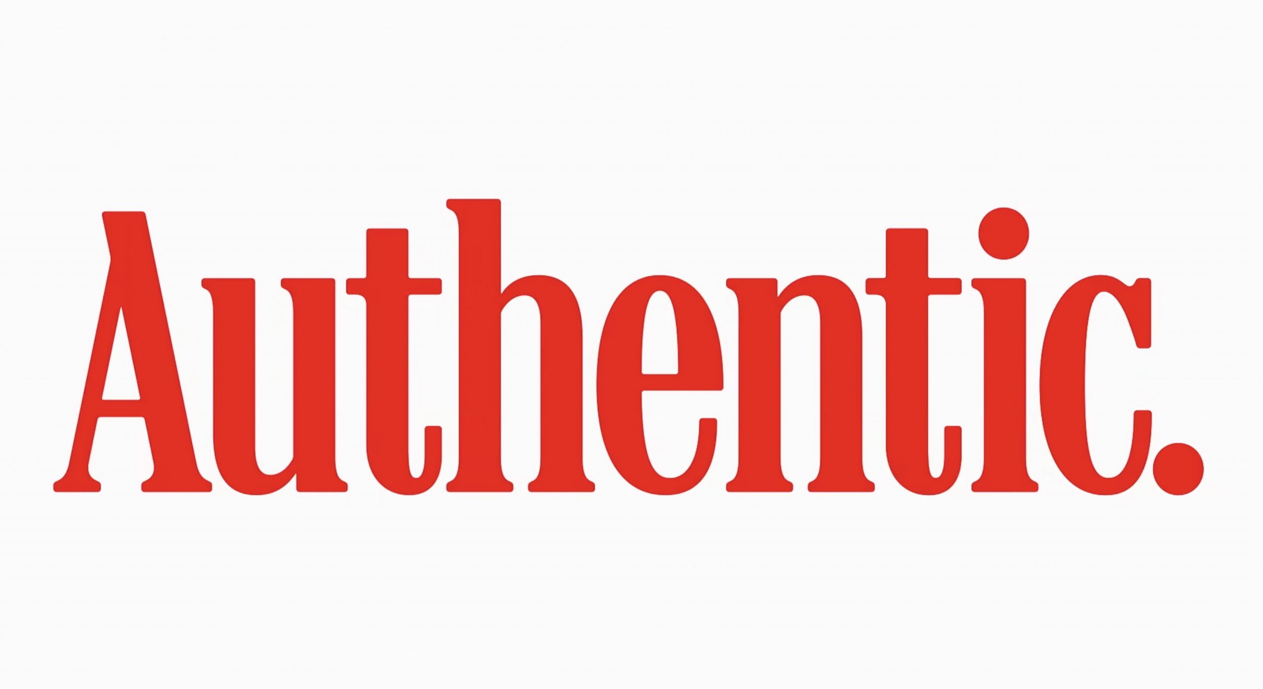
When asked what brand the isolated typeface reminded them of:
| Marlboro | 35% |
| No specific brand | 29% |
| Levi’s | 15% |
| Coca-Cola | 11% |
| Other brands (Target, The Atlantic, Walmart, etc.) | 11% |
Marlboro was named more than three times as often as Coca-Cola. Even secondary Americana brands like Levi’s outranked Coca-Cola in spontaneous recall.
This indicates that while serif typography carries visual signals of heritage, vintage craft, and classic Americana, consumers naturally connect those signals with legacy tobacco and denim brands rather than soft drinks.
Despite this attribution gap, consumer sentiment toward the overall visual refresh remains overwhelmingly positive. Once shown the full product reveal—including the red backdrop and classic Spencerian script logo—74% of respondents rated the packaging update as appealing, with only 5% rating it unappealing.
The Viral Echo Chamber: Memes as the Main Discovery Channel
For modern consumer packaged goods (CPG) brands, visual redesigns rarely make mainstream news headlines on their own. The survey data shows that 87% of consumers had no prior awareness of Coca-Cola’s brand update.
However, among the 13% minority who had encountered the refresh, official brand communications played a minimal role in driving awareness:
- 43% first learned about the refresh through social media posts discussing the font or packaging.
- 26% learned through marketing and design industry publications.
- 9% heard via word-of-mouth.
- 7% learned from official Coca-Cola press releases or brand announcements.
Furthermore, 59% of aware respondents confirmed that the Marlboro comparison memes were the specific trigger that brought the brand update to their attention.
This highlights a critical reality in modern marketing: Brands no longer control the first narrative frame through which visual changes are judged. External cultural reinterpretation—often powered by internet humor—frequently serves as the primary distribution engine for brand news.
Cultural Priming: The “Fridge Cigarette” Connection
The Marlboro comparison did not emerge in a vacuum. Over the past year, social media platforms have seen a surge in “fridge cigarette” memes—slang used by younger professionals and creators to describe taking a crisp, cold Diet Coke break as a daytime vice or ritual.
While overall general population familiarity with the term remains low (22%), it is heavily concentrated among younger audiences:
- 18–24 Year Olds (Gen Z): 57% are familiar with the “fridge cigarette” phrase (35% use/see it regularly).
- 25–34 Year Olds: 38% are familiar.
- 55–64 Year Olds: Only 11% are familiar.
When a brand already occupies a specific “habitual indulgence” mental space among younger demographics, introducing a heavy vintage serif typeface naturally activates cigarette-adjacent visual memories. Among 18–24-year-old respondents, 100% agreed they could see the Marlboro resemblance once pointed out (48% strongly, 52% somewhat).
On-Shelf Impact: Subtle Refinement vs. Disruption
Will this visual overlap cause shoppers to grab the wrong product at retail? Unlikely.
When asked to evaluate the updated packaging against standard Coca-Cola cans and bottles:
- 45% said the packaging changes were noticeable, but barely so.
- 28% felt the packaging looked identical to what they normally see.
- 28% saw significant changes.
Because Coca-Cola’s iconic red color palette, contour bottle silhouette, and primary Spencerian script logo remain dominant on retail shelves, shoppers will not confuse a Coke with a pack of cigarettes during a routine grocery run.
The challenge is not retail inventory confusion; it is distinctiveness. A brand refresh designed to modernize identity and signal authenticity should ideally strengthen brand equity—not borrow visual cues strongly owned by another legacy category.
3 Strategic Lessons for Brand Marketers & Designers
Coca-Cola’s visual refresh provides valuable strategic takeaways for marketers, agency creatives, and brand managers preparing for visual identity updates:
1. Aesthetic Approval Does Not Equal Brand Attribution
A design can test exceptionally well in creative reviews and focus groups for aesthetic appeal (74% approval) while simultaneously failing to build distinctive brand assets (11% attribution). Brand teams must measure visual ownership in isolation—not just consumer likeability—before locking in global design guidelines.
2. You Don’t Own Your Visual Semiotics in the Meme Era
Typography, color blocking, and layout choices do not exist in a vacuum. Internet subcultures actively scan visual assets for cultural hooks, memes, and brand overlaps. When selecting secondary typography or brand extension assets, creative teams must audit visual semiotics across adjacent industries—including tobacco, fashion, and spirits—to anticipate accidental associations.
3. Validate Visual Assets via Blind Agile Testing
Traditional pre-market research often tests complete packaging mockups where dominant brand cues (like Coke’s signature red and script logo) overpower subtle secondary changes. By running agile, unprompted font-isolation tests using platforms like Pollfish, brand teams can identify misattribution risks before rolling out millions of printed units globally.
Survey Methodology
This study was conducted on July 24, 2026, using the Pollfish online survey platform. The sample comprised 400 adult respondents aged 18+ residing in the United States, balanced representatively across age, gender, and geographic region.
About Pollfish
Pollfish is a mobile-first consumer insights platform that delivers real-time survey responses from over 250 million consumers worldwide. By pairing agile methodology with advanced demographic targeting, Pollfish helps brand marketers, agencies, and researchers validate concepts, track trends, and make data-driven decisions in hours, not weeks.
